Introduction to Taupe and Cream Colors
Welcome to the world of colors! Today, we’re diving into an intriguing comparison: taupe versus cream. These two shades have been staples in design and fashion for years, offering unique vibes and versatility. But what sets them apart? Let’s find out!
Understanding Taupe: Characteristics and Usage
Taupe, a color that finds its roots in the French word for mole, is a fascinating mix of gray and brown. This earthy tone resonates with warmth and neutrality, making it a favored choice in various design fields.
Variations of Taupe in Design
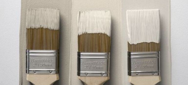
From light to dark, taupe presents a spectrum of shades. Its adaptability allows it to fit seamlessly into different styles, be it rustic, contemporary, or minimalist.
Popular Combinations with Taupe

Pairing taupe with colors like soft pastels or bold hues can create stunning contrasts. It’s a designer’s dream for creating balanced and harmonious spaces.
Exploring Cream: Characteristics and Usage
Now, let’s talk about cream. This color, reminiscent of the rich dairy product, exudes a sense of softness and light. It’s a classic that brings a soothing and calming presence to any setting.
The Versatility of Cream in Interior Design
Cream is a chameleon in interior design, capable of enhancing other colors and creating a sense of spaciousness and light.
Cream in Fashion and Textiles
In fashion, cream offers a timeless elegance. Whether in a chunky knit sweater or a sleek silk dress, it adds a touch of sophistication.
Taupe vs Cream: Comparing and Contrasting
While both colors share a subtle elegance, they differ in mood and application. Taupe brings depth and solidity, whereas cream offers airiness and light.
Visual Impact and Aesthetic Differences
Taupe often adds a grounding effect, while cream can lift and brighten a space. Their visual impacts are distinct yet equally compelling.
Suitability for Various Settings
Taupe works wonders in creating a cozy, secure atmosphere. Cream, on the other hand, is excellent for open, airy environments.
Combining Taupe and Cream

Imagine the elegance when these two colors come together! They complement each other, balancing light and dark, softness and strength.
Tips for Blending Taupe and Cream
Using these colors in textiles, paints, and accessories can create a layered and sophisticated look. It’s all about finding the right balance.
Case Studies in Design
We’ll explore real-life examples where taupe and cream have been used together to create stunning interiors and fashion pieces.
Maintenance and Longevity of Taupe and Cream
When it comes to maintaining and ensuring the longevity of taupe and cream colors in your home or wardrobe, there are a few key points to consider.
Taupe:
- Durability: Taupe, being a darker shade, tends to hide stains and wear better than lighter colors. This makes it a practical choice for high-traffic areas or everyday wear.
- Cleaning: Regular cleaning is essential to keep taupe looking fresh. For fabrics, use gentle detergents and avoid bleach to prevent fading. In interiors, a mild soap and water solution can often do the trick for painted walls or furniture.
- Sunlight Exposure: While taupe is less prone to fading than brighter colors, prolonged exposure to sunlight can still affect its intensity. Using UV-protective window treatments can help mitigate this.
Cream:
- Stain Visibility: Cream colors can be more challenging to maintain due to their lightness. Stains and spills are more visible, requiring prompt cleaning.
- Fabric Care: For cream textiles, opt for stain-resistant fabrics or treatments, especially in high-use areas. Consider slipcovers for furniture, which can be easily removed and washed.
- Touch-ups and Repaints: In interior design, cream walls may need more frequent touch-ups or repaints to keep them looking pristine. Choosing high-quality, washable paint can make maintenance easier.
Combining Taupe and Cream:
When using both colors together, balance is key. Use taupe in areas more prone to wear and tear, and reserve cream for spaces where you want to create a sense of openness and light. By understanding the maintenance needs of each color, you can keep your spaces and items looking beautiful for longer.
In conclusion, both taupe and cream have their specific maintenance needs. By taking these into consideration, you can enjoy the beauty and elegance these colors bring to your life for many years to come.
Conclusion: Choosing Between Taupe and Cream
In conclusion, both taupe and cream offer unique advantages. Your choice depends on the mood and functionality you desire in your space.
FAQs
Both taupe and cream have their unique forms of versatility. Cream is unparalleled in creating brightness and a sense of space, making it a great choice for small rooms or areas lacking natural light. Taupe, with its earthy richness, offers a more grounded and sophisticated feel, making it ideal for both modern and traditional settings.
Absolutely! In small spaces, the combination of taupe and cream can create a harmonious balance. Taupe grounds the space, while cream adds lightness, preventing the area from feeling cramped. It’s all about finding the right shades and proportions to ensure the space doesn’t feel overwhelmed.
Taupe pairs beautifully with a variety of colors. For a nature-inspired palette, combine it with greens and blues. For something more dramatic, consider pairing taupe with deep burgundy or navy. And for a subtle, sophisticated look, mix taupe with blush pink or soft lavender.
Cream-colored textiles can be surprisingly resilient, especially when made from durable materials like wool or synthetic blends. For high-traffic areas, opt for textiles with a mix of cream and other colors or patterns, which can help conceal wear and tear more effectively.
Yes, color psychology plays a significant role in how we perceive these colors. Taupe, being a blend of brown and gray, often evokes feelings of stability, reliability, and comfort. Cream, on the other hand, is associated with calmness, elegance, and purity. Both colors can help create a peaceful and serene environment, making them excellent choices for spaces where relaxation is key.
In conclusion, both taupe and cream have unique qualities that make them beloved in design and fashion. Whether used individually or combined, these colors can create environments that are both aesthetically pleasing and emotionally comforting. When selecting between taupe and cream, consider the mood, style, and practicality you want to achieve in your space.


