
When it comes to choosing the perfect shade of grey for your walls, two popular options stand out: Mindful Grey and Agreeable Grey. These interior design paint choices are both versatile and can enhance the aesthetic of your modern home. In this article, we will compare Mindful Grey and Agreeable Grey, helping you make an informed decision about which one is the best choice for you.
Both Mindful Grey and Agreeable Grey offer unique qualities that can elevate your interior design. By taking a closer look at their undertones, appearance under different lighting, and coordinating colors, we can determine which shade is a better fit for your walls.
Key Takeaways:
- Mindful Grey and Agreeable Grey are popular grey paint choices for modern homes.
- Understanding the undertones, appearance under different lighting, and coordinating colors can help you make an informed decision.
- Consider the overall aesthetic and lighting conditions in your space before choosing between Mindful Grey and Agreeable Grey.
- Mindful Grey has green undertones and appears as a warm grey.
- Agreeable Grey is a warm greige with taupe, violet, and slight green undertones.
Mindful Grey (SW 7016)
Mindful Grey, coded as SW 7016, is a warm grey paint color with green undertones. It is a medium-tone grey that can appear different depending on the lighting conditions in a room. In a dark room or with dark furniture, the green undertone becomes more evident. In a light-filled room, it will look more like a warm grey.
When using Mindful Grey, it is important to consider the surrounding furnishings and other colors. The appearance of Mindful Grey in different lighting can create a unique atmosphere in your space. Its warm grey with green undertones adds depth and character to any room.
“Mindful Grey adds a touch of sophistication and warmth to my living room. The green undertones give it a subtle hint of color that complements my decor perfectly.” – Sarah, satisfied homeowner
Coordinating Colors with Mindful Grey
Mindful Grey pairs well with a variety of coordinating colors. Whether you prefer a monochromatic look or want to create contrast, these colors will complement and enhance the appearance of Mindful Grey:
| Coordinating Colors | Hex Code |
|---|---|
| Pearly White | #EAF0F0 |
| Homburg Gray | #BEBDB7 |
| Eider White | #ECEDE2 |
| Naval | #2C3E4C |
| Riverway | #617D8A |
Agreeable Grey (SW 7029)
When it comes to warm grey paint colors, Agreeable Grey (SW 7029) is a top contender. This popular choice offers a soft and inviting greige tone that adds warmth to any space. With its subtle taupe and light violet hints, Agreeable Grey creates a cozy and welcoming atmosphere.
One of the remarkable features of Agreeable Grey is its versatility under different lighting conditions. Depending on the natural or artificial light in the room, this paint color can appear warmer or more muted. This adaptability makes it an excellent choice for rooms with varying light sources and intensities.
In interior design, coordinating colors play a crucial role in creating a harmonious and cohesive look. Agreeable Grey can be beautifully paired with a variety of colors to achieve the desired aesthetic. Some coordinating colors that work well with Agreeable Grey include Extra White (SW 7006), Coral Rose (SW 9004), Incredible White (SW 7028), Dovetail (SW 7018), and Brainstorm Bronze (SW 7033). These color combinations create depth and visual interest, enhancing the overall appeal of your space.
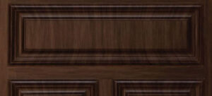
See the image below to get a better idea of the warm and inviting appearance of Agreeable Grey:

Differences Between Mindful Grey and Agreeable Grey
While Mindful Grey and Agreeable Grey are both warm grey paint colors, they have distinct differences that set them apart. Understanding these differences can help you make an informed decision when choosing the right shade for your home.
“Mindful Grey has green undertones while Agreeable Grey has taupe, violet, and slight green undertones.”
One of the key differences between Mindful Grey and Agreeable Grey is their undertones. Mindful Grey has prominent green undertones, which can give it a fresh and cool appearance. On the other hand, Agreeable Grey has taupe, violet, and slight green undertones, which create a warmer and more muted look.
Another notable difference is the color intensity. Mindful Grey is considered a medium-tone grey, striking a balance between light and dark. In contrast, Agreeable Grey leans more towards a warmer greige, which is a combination of grey and beige.
Moreover, both shades can appear differently under various lighting conditions. Mindful Grey can take on a greener hue in rooms with less natural light or darker furnishings. On the other hand, Agreeable Grey can appear warmer or more subtle depending on the lighting, creating a versatile and adaptable aesthetic.
Coordinating Colors
When it comes to coordinating colors for Mindful Grey and Agreeable Grey, each shade has its own set of complementary options. These coordinating colors can help enhance the undertones and create a cohesive color palette for your space.
| Mindful Grey (SW 7016) | Agreeable Grey (SW 7029) |
|---|---|
| Pearly White (SW7009) | Extra White (SW 7006) |
| Homburg Gray (SW7622) | Coral Rose (SW 9004) |
| Eider White (SW 7014) | Incredible White (SW 7028) |
| Naval (SW 6244) | Dovetail (SW 7018) |
| Riverway (SW 6222) | Brainstorm Bronze (SW 7033) |
By selecting coordinating colors that complement the undertones of each shade, you can create a harmonious color scheme that brings out the best in Mindful Grey or Agreeable Grey.

Image: The visual representation highlights the differences between Mindful Grey and Agreeable Grey
Pros and Cons of Mindful Grey and Agreeable Grey
When it comes to choosing between Mindful Grey and Agreeable Grey, considering their pros and cons can help you make an informed decision. Let’s take a closer look at the advantages and disadvantages of each shade.
Mindful Grey (SW 7016)
- Advantages: Mindful Grey has a warm grey appearance that adds a cozy and inviting feel to any room. It has the ability to evoke different undertones depending on the lighting and surrounding furnishings, allowing for versatility in design.
- Disadvantages: However, Mindful Grey may not be the ideal choice for darker spaces or rooms with limited natural light, as it can appear darker in such conditions, potentially making the room feel smaller.
Agreeable Grey (SW 7029)
- Advantages: Agreeable Grey is praised for its versatility as a warm greige paint color. It blends well with different rooms and lighting conditions, making it a safe and reliable choice for various interior design styles.
- Disadvantages: However, Agreeable Grey may not pair well with violet-tinted grays, as the undertones can clash. Additionally, in darker rooms, it might lose some of its warmth and may appear less vibrant.
Considering the advantages and disadvantages of Mindful Grey and Agreeable Grey can help you choose the shade that aligns best with your preferences and the specific requirements of your home’s interior.

Conclusion
After carefully comparing Mindful Grey and Agreeable Grey, it is clear that both of these grey paint colors are excellent choices for your interior design. Mindful Grey offers a warm grey appearance with noticeable green undertones, while Agreeable Grey leans towards a warmer greige with taupe, violet, and slight green undertones.
It is important to consider the lighting conditions and furnishings in your space when choosing between these two shades. Mindful Grey’s green undertones may become more evident in darker rooms or with dark furniture, while Agreeable Grey offers a versatile warm greige option that works well in different lighting conditions.
When deciding between Mindful Grey and Agreeable Grey, consider your personal preferences and the desired aesthetic for your home. Both shades have coordinating colors that complement their undertones, allowing you to create a cohesive and stylish look.
In conclusion, there is no right or wrong choice between Mindful Grey and Agreeable Grey. The best pick will depend on your specific needs, the lighting in your space, and the overall style you are aiming for. So, take your time, consider all factors, and choose the grey paint color that speaks to you and enhances the beauty of your home.
FAQ
What are the differences between Mindful Grey and Agreeable Grey?
Mindful Grey has green undertones, while Agreeable Grey has taupe, violet, and slight green undertones. They also have different appearances under various lighting conditions.
What are some coordinating colors for Mindful Grey?
Coordinating colors for Mindful Grey include Pearly White (SW7009), Homburg Gray (SW7622), Eider White (SW 7014), Naval (SW 6244), and Riverway (SW 6222).
What are some coordinating colors for Agreeable Grey?
Coordinating colors for Agreeable Grey include Extra White (SW 7006), Coral Rose (SW 9004), Incredible White (SW 7028), Dovetail (SW 7018), and Brainstorm Bronze (SW 7033).
What are the pros and cons of Mindful Grey?
The advantages of Mindful Grey include its warm grey appearance and the way it can evoke different undertones depending on lighting and surrounding furnishings. However, it may not be ideal for darker spaces or rooms without a lot of natural light.
What are the pros and cons of Agreeable Grey?
The advantages of Agreeable Grey include its versatility as a warm greige that works well in different rooms and lighting conditions. However, it may not pair well with violet-tinted grays or in dark rooms.
