When it comes to interior design and home decor, selecting the right color scheme is a critical decision. Two popular choices that often find their way into homes are Paper White and Classic Gray. These hues offer distinct aesthetics and can dramatically impact the ambiance of a space. In this article, we’ll explore the differences between Paper White and Classic Gray to help you make an informed decision for your interior design project.
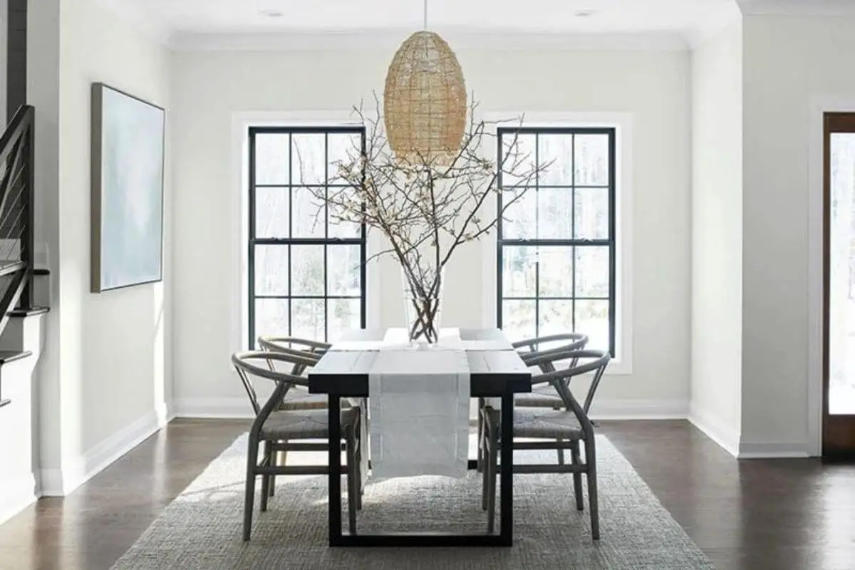
Paper White: Timeless Elegance
Characteristics of Paper White
Paper White is a crisp, clean shade of white with subtle undertones that can lean slightly warm or cool, depending on the lighting and surroundings. It’s a versatile and timeless color that complements various decorating styles, from traditional to modern.
Advantages of Paper White
- Neutral Base: Paper White serves as an excellent neutral base, making it easy to pair with a wide range of colors and materials.
- Bright and Airy: It has the ability to make a space feel bright, open, and airy, making it ideal for smaller rooms or spaces with limited natural light.
- Timeless Appeal: Paper White doesn’t go out of style and can adapt to changing decor trends.
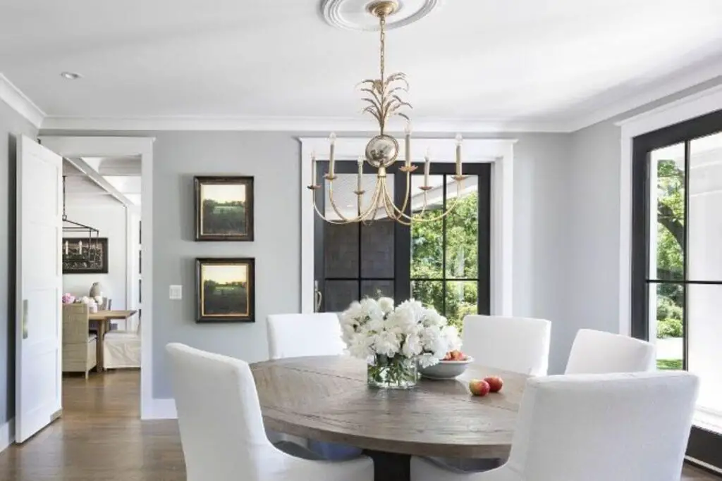
Classic Gray: Understated Sophistication
Characteristics of Classic Gray
Classic Gray is a soft, muted gray color that exudes understated sophistication. It strikes a balance between warmth and coolness, making it a versatile choice for various design schemes. This color can create a sense of calm and serenity in a room.
Advantages of Classic Gray
- Timeless Charm: Classic Gray has a timeless quality that adds a touch of elegance to any space.
- Versatility: It pairs well with a wide range of colors and can adapt to both traditional and contemporary design styles.
- Enhanced Coziness: Classic Gray can create a cozy and inviting atmosphere in living spaces.
Paper White vs. Classic Gray: Key Differences
Let’s compare these two color options in terms of their primary differences:
1. Color Tone
- Paper White: A shade of white with subtle warm or cool undertones.
- Classic Gray: A soft, muted gray with a balanced warmth and coolness.
2. Ambiance
- Paper White: Creates a bright and airy atmosphere, ideal for smaller or darker spaces.
- Classic Gray: Evokes a sense of calm and sophistication, lending itself to creating cozy interiors.
3. Versatility
- Both: Both Paper White and Classic Gray are versatile and can complement a variety of design styles and color palettes.
4. Timelessness
- Both: Both colors have a timeless quality, ensuring that your interior will remain stylish for years to come.
5. Lighting
- Consideration: The choice between Paper White and Classic Gray may depend on the lighting conditions and the mood you want to create in your space.
Conclusion
In the decision between Paper White and Classic Gray for your interior design project, consider the mood and atmosphere you want to achieve in the space. Paper White offers a bright and airy feel, ideal for spaces with limited natural light, while Classic Gray brings understated sophistication and coziness to a room. Both colors have a timeless appeal and can adapt to various design styles. Ultimately, the choice comes down to your personal preferences and the specific aesthetic you envision for your home.
FAQs
1. Which color, Paper White or Classic Gray, is better for a small room with minimal natural light?
For a small room with limited natural light, Paper White may be the better choice. Its bright and airy qualities can help make the space feel more open and less confined.
2. Can I use both Paper White and Classic Gray in the same room or space?
Yes, you can use both Paper White and Classic Gray together in the same room. They can create a balanced and harmonious color scheme when used strategically, such as with contrasting walls and accents.
3. Do Paper White and Classic Gray work well with different decor styles?
Yes, both colors are versatile and can complement a wide range of decor styles, including traditional, contemporary, and transitional.
4. Will Classic Gray make a room feel too cold or sterile?
Classic Gray is known for its balanced warmth and coolness, which can create a cozy and inviting atmosphere. It typically doesn’t make a room feel cold or sterile unless paired with extremely cool-toned accents.
5. Are there other factors besides lighting to consider when choosing between these colors?
Certainly. Consider the existing color scheme, furniture, and decor in the room, as well as your personal preferences and the mood you want to establish in the space. Sample swatches of both colors in the room to see how they interact with the existing elements.
6. Can I use either color for all the walls in a room, or is it better to have an accent wall?
Both options can work for all the walls in a room, but it’s also common to create an accent wall with a contrasting color or texture to add visual interest. The choice depends on your design goals and preferences.
7. Are there variations in Paper White and Classic Gray that I should be aware of when selecting paint or materials?
Yes, both Paper White and Classic Gray can have subtle variations in undertones depending on the specific brand and formulation of paint or materials you choose. It’s advisable to obtain paint samples or material swatches and test them in your space to see how they appear under your lighting conditions.
8. Can I change the mood of a room by using different shades or tones of Paper White or Classic Gray?
Yes, using lighter or darker shades of Paper White or Classic Gray can significantly impact the mood of a room. Lighter shades tend to create a brighter and more open feeling, while darker shades can add coziness and depth.
9. Are there specific color combinations that work well with Paper White and Classic Gray?
Both colors are highly adaptable and pair well with various color combinations. Neutrals, pastels, bold accents, and natural materials all complement Paper White and Classic Gray effectively. The choice of complementary colors depends on your desired style and mood.
10. Can I use these colors in commercial or office spaces, or are they primarily for residential use?
Both Paper White and Classic Gray are suitable for both residential and commercial spaces. They offer a timeless and professional appearance that can enhance the aesthetics of offices, retail stores, and other commercial environments.


